

Product Design & Experience, Branding
JUMP’s logo is a single line drawn without lifting the pen. That one unbroken line runs through everything — from the app screens to the way things move. The aesthetic remains simple, with one colour, one line and one voice, so the logo itself reveals the brand personality instead of merely functioning as a decoration.
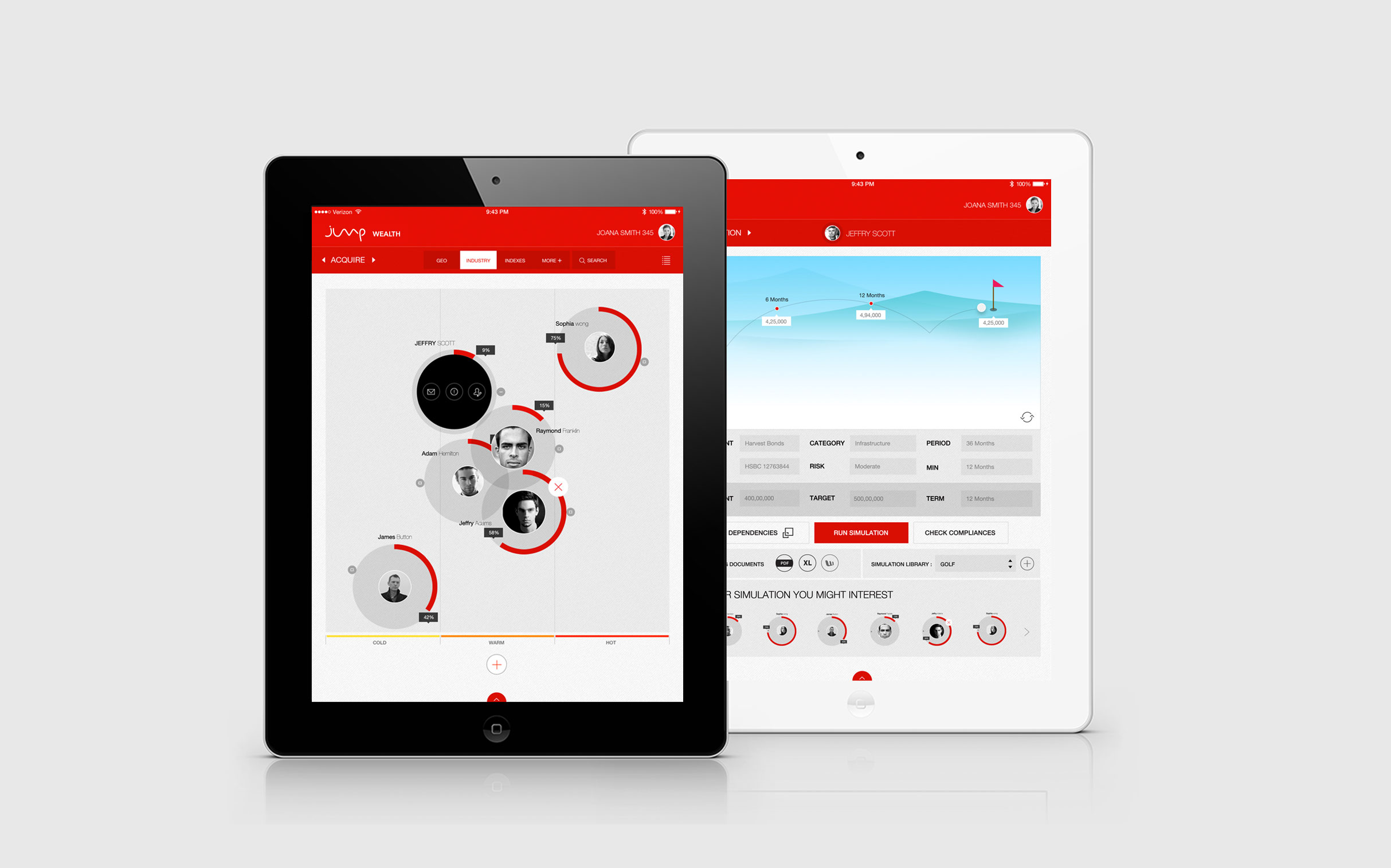
Jump Wealth
A tablet app that wealth advisors use with their clients, side by side. Portfolio, investment mix and performance sit on one screen, so the conversation about money happens over the device instead of through a printed report.
The most important number is always the biggest, and details appear only when someone asks for them. Because the clients are wealthy, the look borrows from worlds they already know, like golf, so a portfolio feels familiar rather than like a spreadsheet.
The product screens above are only a glimpse; the full product is confidential and built for banks.
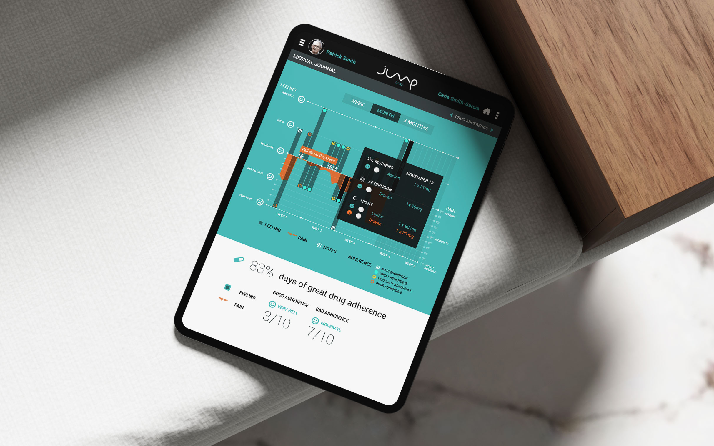
Jump Care
A health journal for patients and the family members who look after them. Either one can log pain, mood and medicines taken, all on one timeline, so a month of entries reads as one clear picture.
The app scores how well the patient sticks to their medicines, which is the first thing a doctor asks about. It was built for an insurance programme that rewards healthy habits, and it brings together four groups — drug makers, caregivers, patients and insurers — to ease communication.
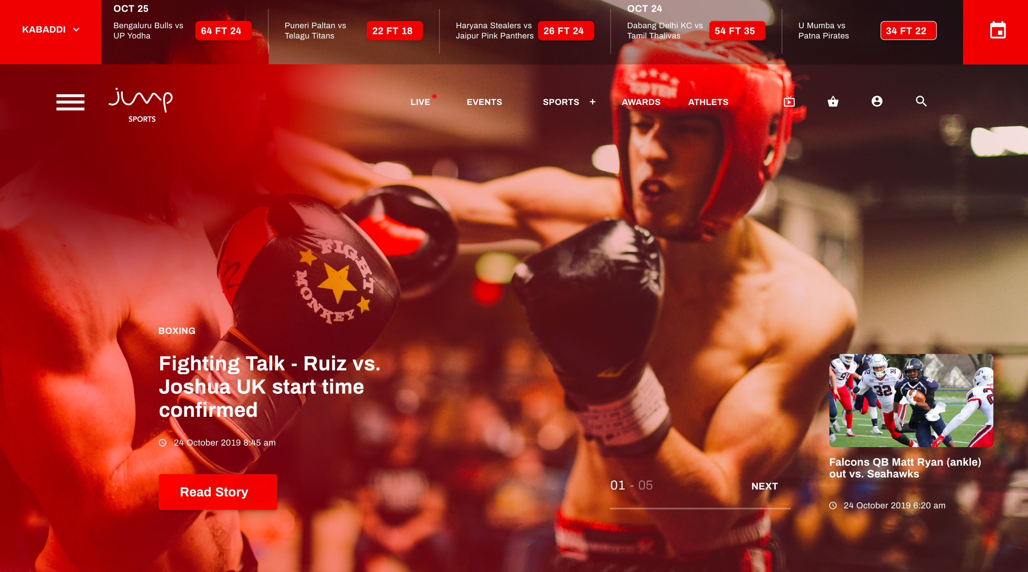
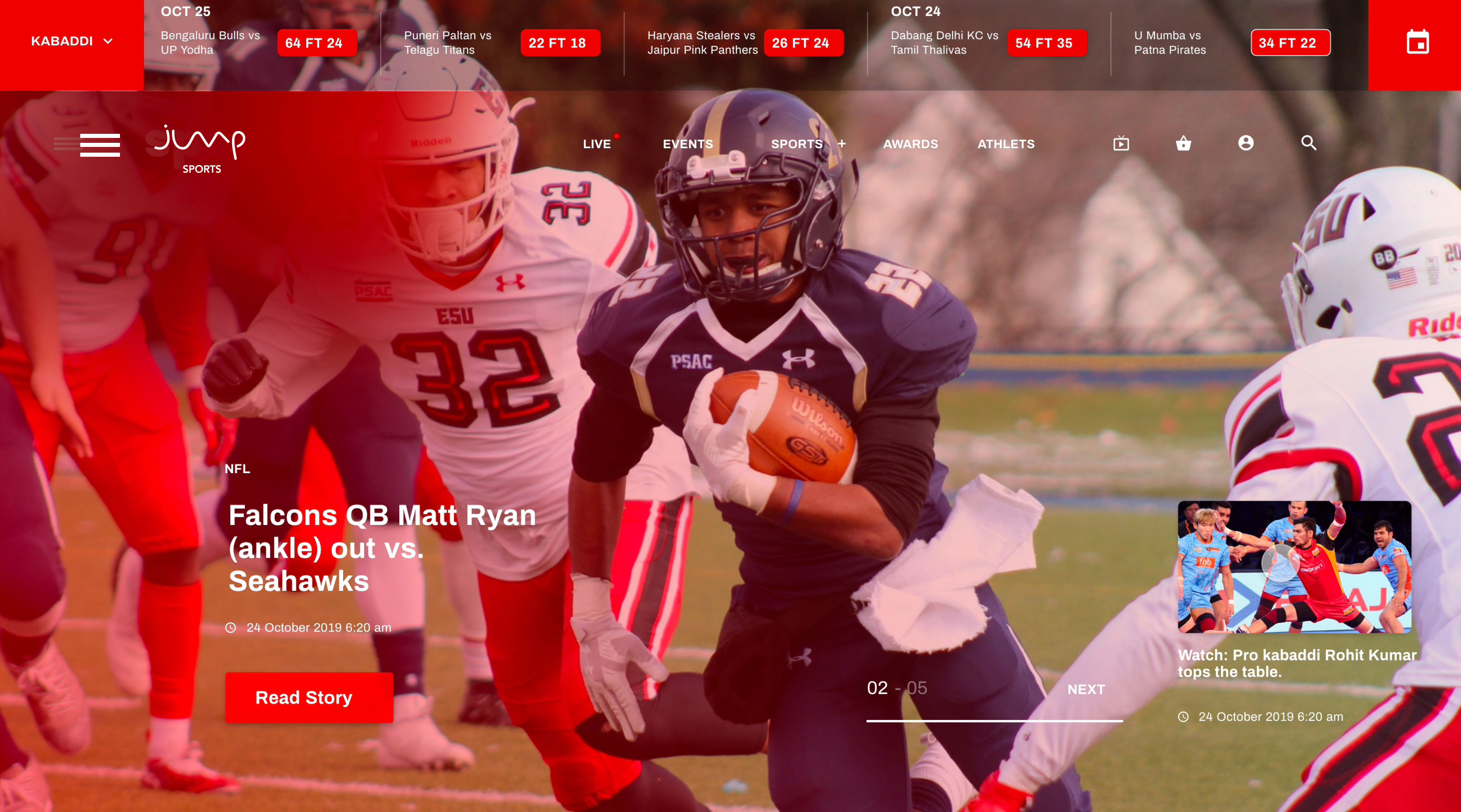
Jump Sports
A sports news and live-score app covering every league and region in one place. Each story fills the screen as a photo, with live scores pinned above it and the next story waiting in the corner.